From The Huffington Post:
It’s strange to think that although we encounter letters and numbers all the time, the little guys are normally confined to a page or a screen. That is, until one bold MFA student dared to take her ABCs out of the two-dimensional world and into her environment — the urban playground of Chicago.
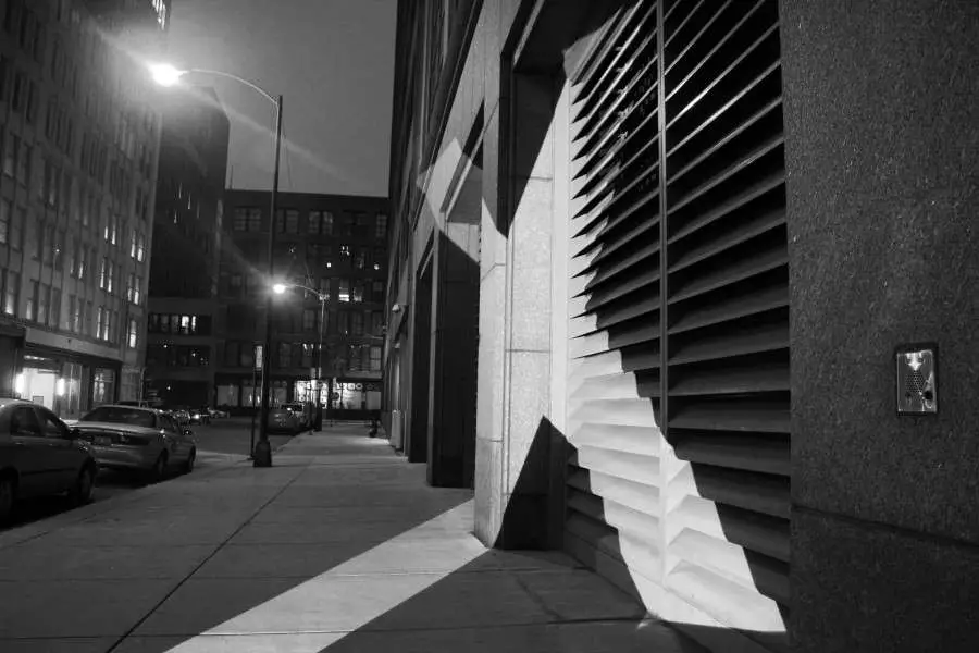
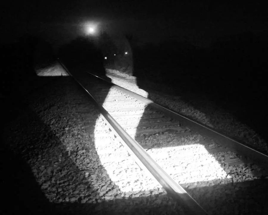
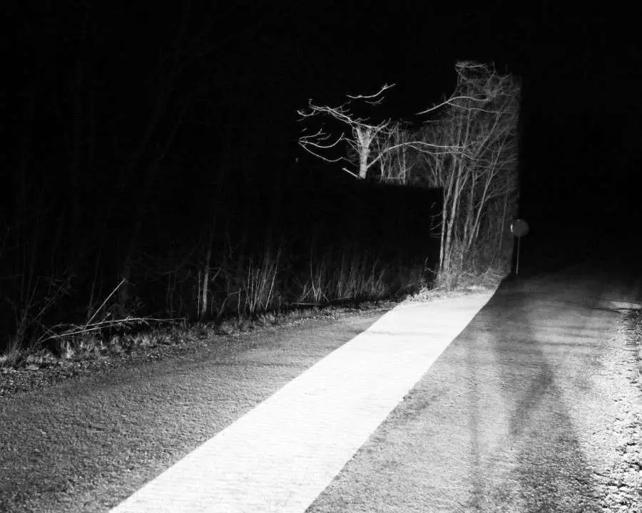
Audra Hubbell embarked upon this artistic endeavor for her MFA thesis, in which she explored the power of large-scale typography. By projecting gigantic, single letters onto Chicago’s buildings, streets and art installations, Hubbell illuminates how surrounding space shapes her letterforms, and how they in return shape space. It turns out, the relationship was quite amicable.
“The three-dimensional space transformed the letterforms into completely unexpected shapes,” Hubbell explained in an email to the Huffington Post. “The project became about finding the perfect harmonies in the formal qualities of the letter and the visual themes of the space itself.”
Cast in noir-style darkness, the minimalist letters radiate an ominous and powerful air, showcasing their power to stand alone — outside language — as pure shapes. Projected alongside everything from rural train tracks to Anish Kapoor’s “Cloud Gate,” the letters turn Chicago’s landscape into a stunning and cryptic message.
“I also feel as though it is important to mention that I was certainly not the first artist to project letters onto architecture,” Hubbell wrote. “These artists include Imi Knoebel, Jenny Holzer, and Tobias Battenberg to name a few.” What are your favorite examples of typography and art crossing paths? Let us know in the comments.
See all of the pics here.


